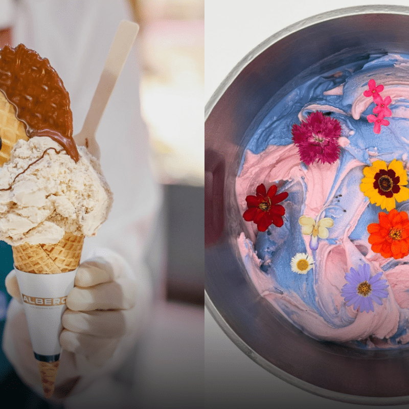
Food & Drink
10 Best Gelato Spots to Welcome the Summer Heat
Explore the 10 best gelato spots in Bangkok and nearby cities, where ...


In this column, he finds out why Thai design now favours monochrome over its traditional taste for vivid colour.
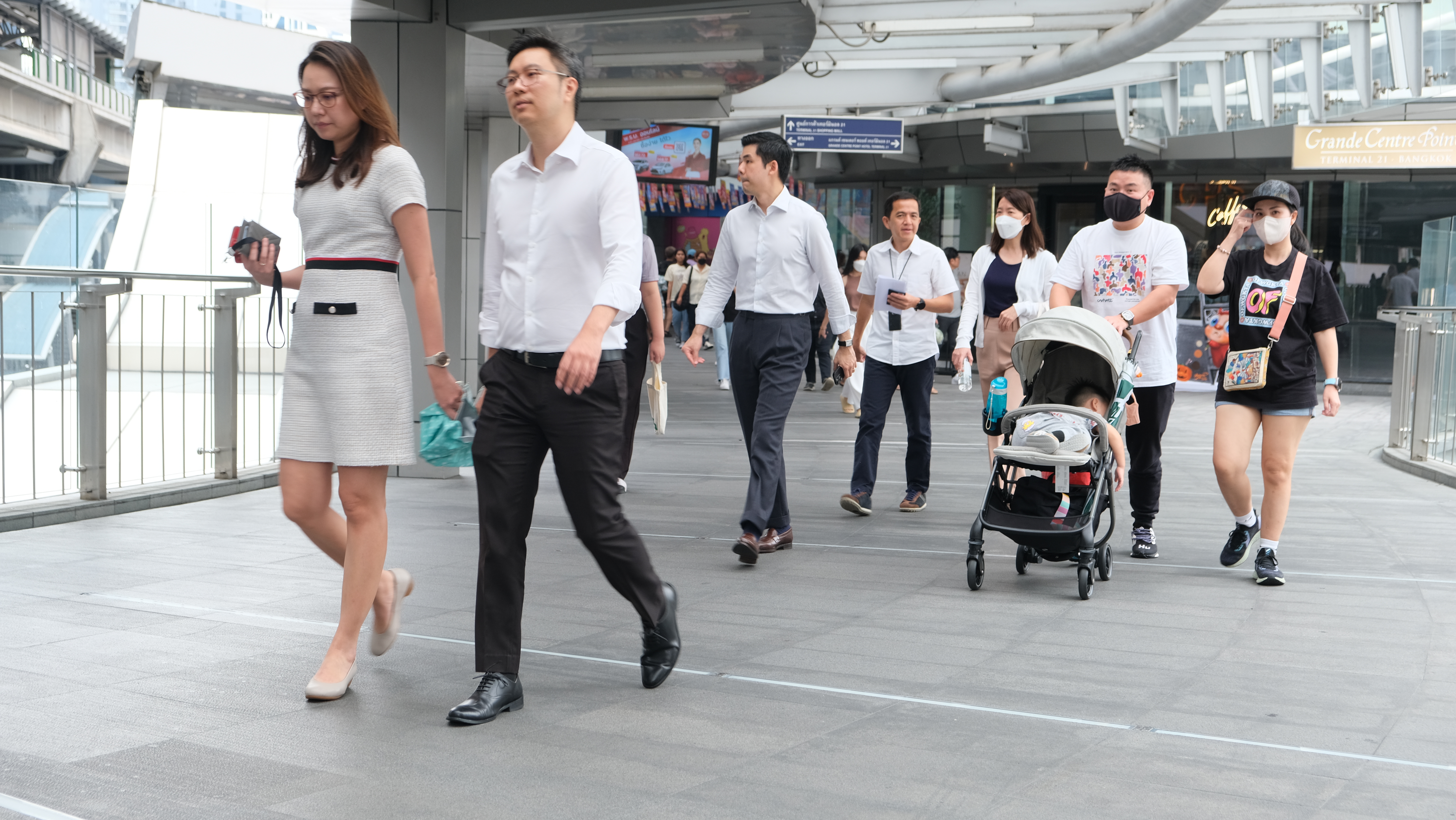
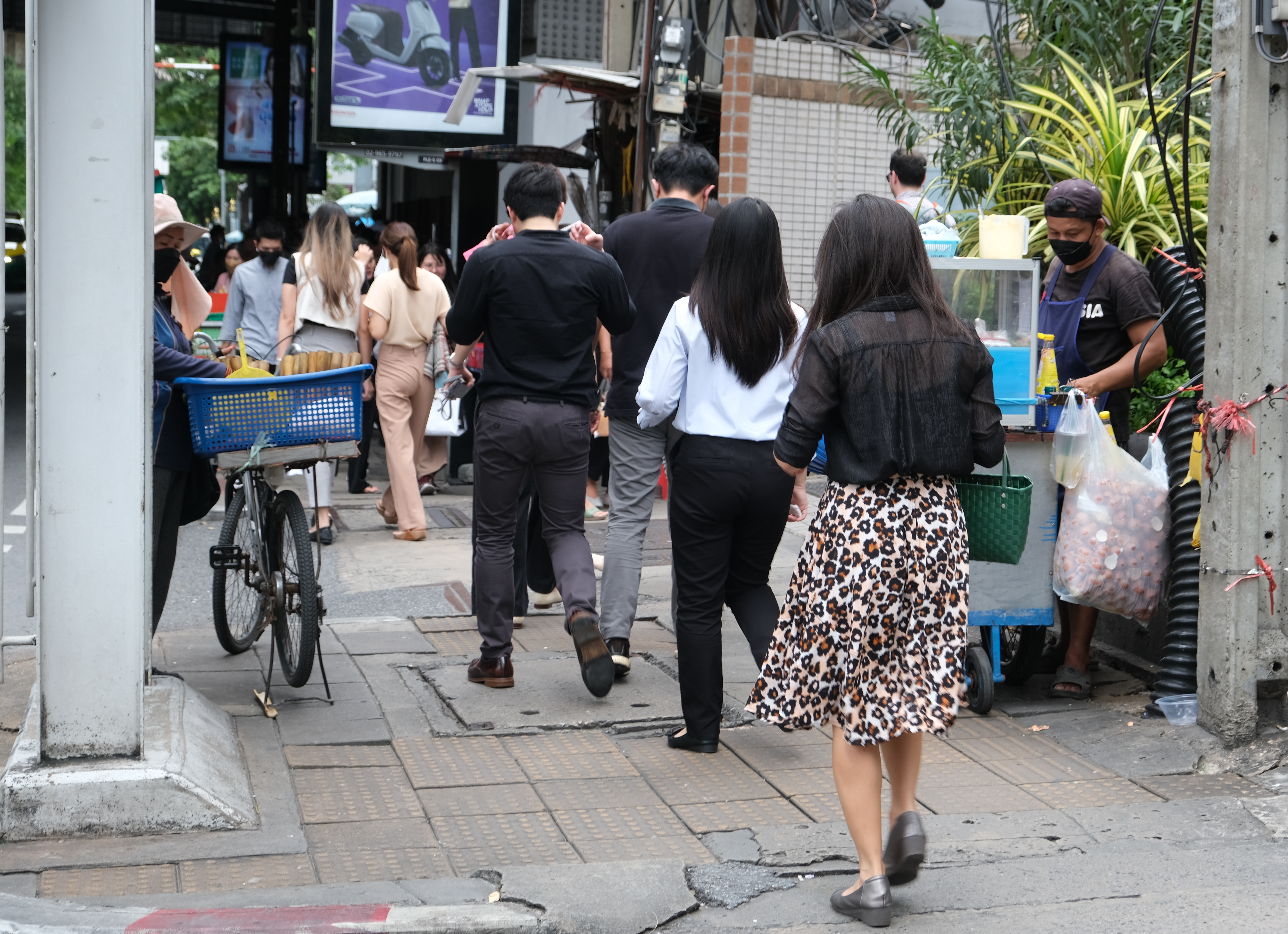
When I arrived in Thailand in the 1990s, Bangkok was a riot of colour. Buildings like Baiyoke I Tower were as polychromatic as the public’s clothes. Office ladies, hi-so dames and influential men in Versace would combine colours as brashly as folk singers’ costumes. The city remains vivid by world standards, but the palette is noticeably subtler, even muted. In trains and nightlife alike, half the people dress in black, as they would in New York. Where did all the pigment go?
One of the culprits is globalisation, which brings cultures into contact – or rather into competition as disposable styles to adopt, then drop. Fashions past have been influenced by fads for chinoiserie, Indian textiles or Egyptian-esque art deco. In the opposite direction, Western styles merged into localised hybrids, like Thailand adopting the Prussian white naval jacket or puff-sleeved camisole. Overall, such eclectic flows just added to the maximalism of Thai taste.
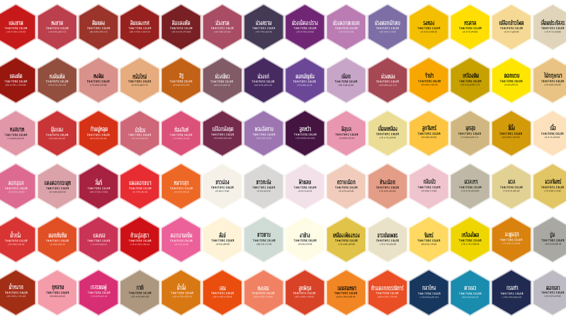
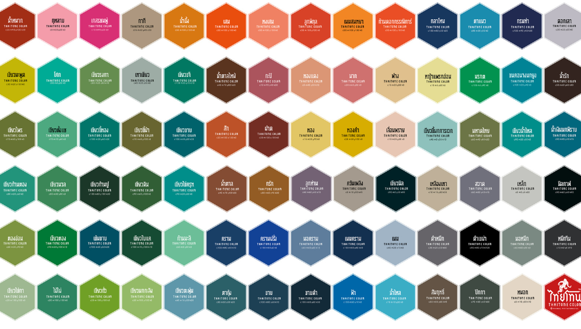
A Thai artist, Pairoj Pittayamatee, has distilled the precise hues of Thai culture into a paint range called ThaiTone. However, it also preserves a heritage, as fewer Thais infuse their lives with traditional hues.
Since the 1980s, intensified globalisation has flattened variety through mass travel, transnational chains, and worldwide media. The practical demands of corporate identity, pooling costs and appealing to the widest demographic has sped the triumph of minimalism.
Lately, there’s been a backlash in the West as grey becomes the new black. Seemingly every car, frock or front door is a non-committal shade of blah. Even in pallid Europe, people wonder why the Pantones faded.
Critics from India to Indiana now wield the buzzword “chromophobia,” coined by the Scottish writer and artist David Batchelor to label the systematic marginalisation and degrading of “primitive” colour. It’s used as a rather broad brush to tar the soberly dressed as being Orientalists who fear the exotic “other.” Minimalism is now a villain ripe for “de-colonisation.” True, bright ethnic colours have at times been derided in the West as vulgar, low or decadent, though regarding it as sumptuous also gets deemed Orientalist. Yet besides social control, there are practical and cultural reasons that legitimise anaemic design.
My mother got a silk jacked tailored in Bangkok in a shade of turquoise that suits her in Siam, but screams kitsch in Salisbury. In the humid tropics, the prismatic light makes bright hues dazzle. In the softer climes of the cloudy north, pale skin simply looks better in autumn shades.
Colour choice is not just about interpretation, but physiologically affects our mood. We think of sight as one sense, when actually it is three: separate receptors perceive form, colour, and emotional responses. Thailand’s outgoing, boisterous character is related to its exuberant colour. Likewise, the desaturating of Thai tones has come during a depressed time.
This flight from colour feels Puritan – and that’s historically true. The Protestant Reformation led to churches stripped of decoration and austere rooms like those painted by Vermeer, whose retrospective was this year’s hippest exhibition. Monochrome aligns with a belief system that’s been internalised as expressing a virtuous “good taste.” Similarly, acting “cool,” typically wearing black, isn’t just a hip pose; it affects a detached superiority. In the 2000s, Thailand started presenting itself as cool. Contemporary Thai design has become ever more pared back, reducing the country’s rich crafts to sparse motifs against monochromes.
Meanwhile, colour was expressing Thai beliefs so strongly that getting dressed became a minefield. Political divisions got so distilled into Red Shirts versus Yellow Shirts that a visiting Hillary Clinton had to wear turquoise, just like my mother.
The Red Shirts got their hue from the flag’s colour that symbolised “nation,” while the Yellow Shirts drew from the colour of the King’s Monday birth. Many Thais had long simplified what-to-wear by donning the colour of the day, drawn from planetary gemmology and its ruling deities: yellow (moon, Monday), pink (Mars, Tuesday), green (Mercury, Wednesday daytime), orange (Neptune, Thursday), blue (Jupiter, Friday), purple (Saturn, Saturday), red (sun, Sunday). Then it became wise to modify your wardrobe, to look either partisan or neutral.
Black had rarely been worn, being associated with the Wednesday night god of eclipses, Rahu, an ill omen. Then in 2016, black was decreed the dress code for the months-long mourning of King Bhumibol the Great. Because every resident needed multiple changes of black clothes, these outfits lasted for years.
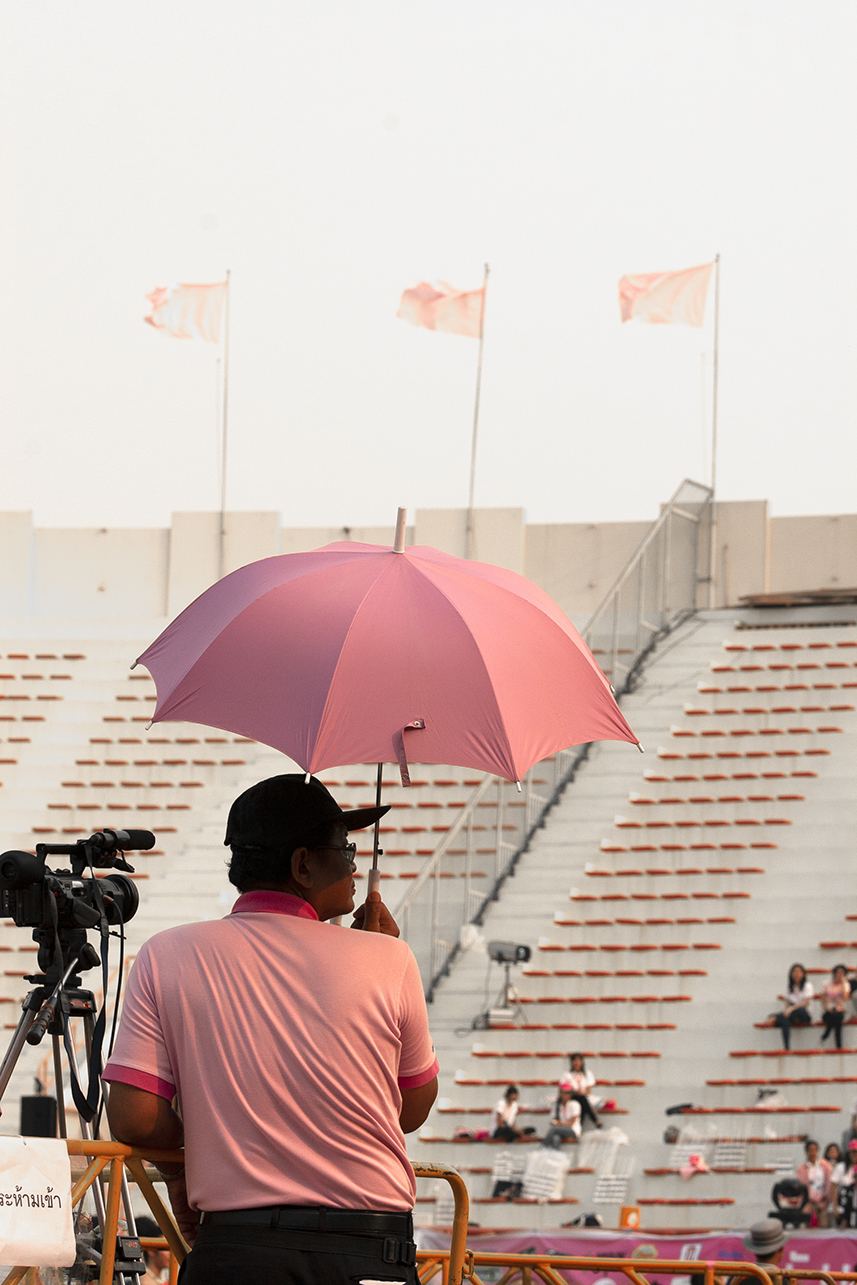
Eventually, as much black was being habitually worn here as in Milan. It simplifies dressing decisions. And as Bangkok gets more corporate, greyscale appears more “professional.” I notoriously still wear bright shirts, but in bars I now feel like those chromophobic adjectives: vulgar, low or decadent.
Concern that Thai aesthetics have changed forever is dispelled by big data. Thanks to the filter options on apps like Instagram, we can learn the colour preferences of countries or cities. It turns out that Bangkok is a unique outlier in both pose and palette.
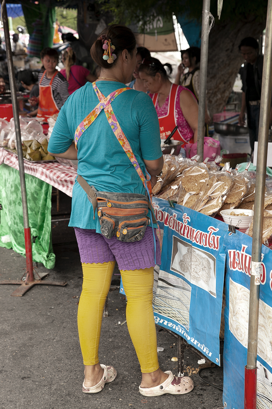
Millions of combined selfies reveal an average Bangkokian who tends to tilt their head and gaze sightly upward with wide eyes and pursed smile, in deferential sweetness. Filterwise, there are few arty black-and-whites here, nor many pastels. Bangkok’s pixel penchant is for brilliance, saturated to the max. While fashions give a mellower impression, selfies reveal that Thais still have an eye for bright jewel colours.
This twice-monthly column is syndicated by River Books, publisher of Philip Cornwel- Smith’s bestselling books Very Thai: Everyday Popular Culture and Very Bangkok: Inthe City of the Senses. The views expressed by the author of this column are his own and do not necessarily reflect the views of Koktail magazine.
Explore the 10 best gelato spots in Bangkok and nearby cities, where ...
Wandering around the globe, try out the signature tastes of cultures across ...
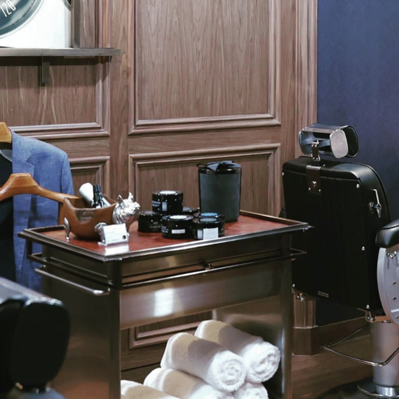
These top 5 barber shops in Bangkok are where gentlemen can elevate ...

Dive into the magic as Starbucks teams up with Warner Bros, offering ...
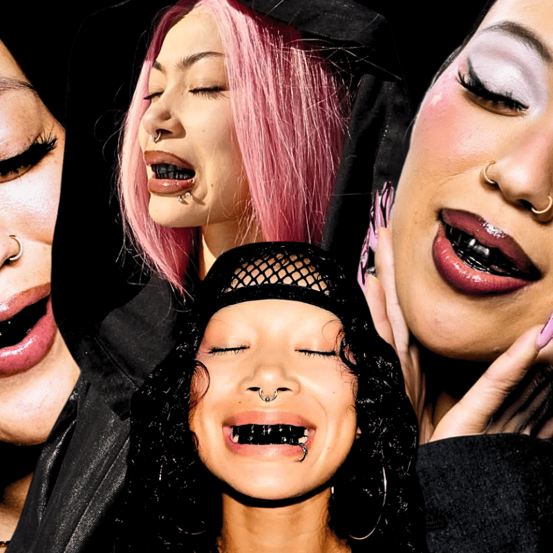
Sailorr and Molly Santana’s black grills fuse hip-hop swagger with homage to ...
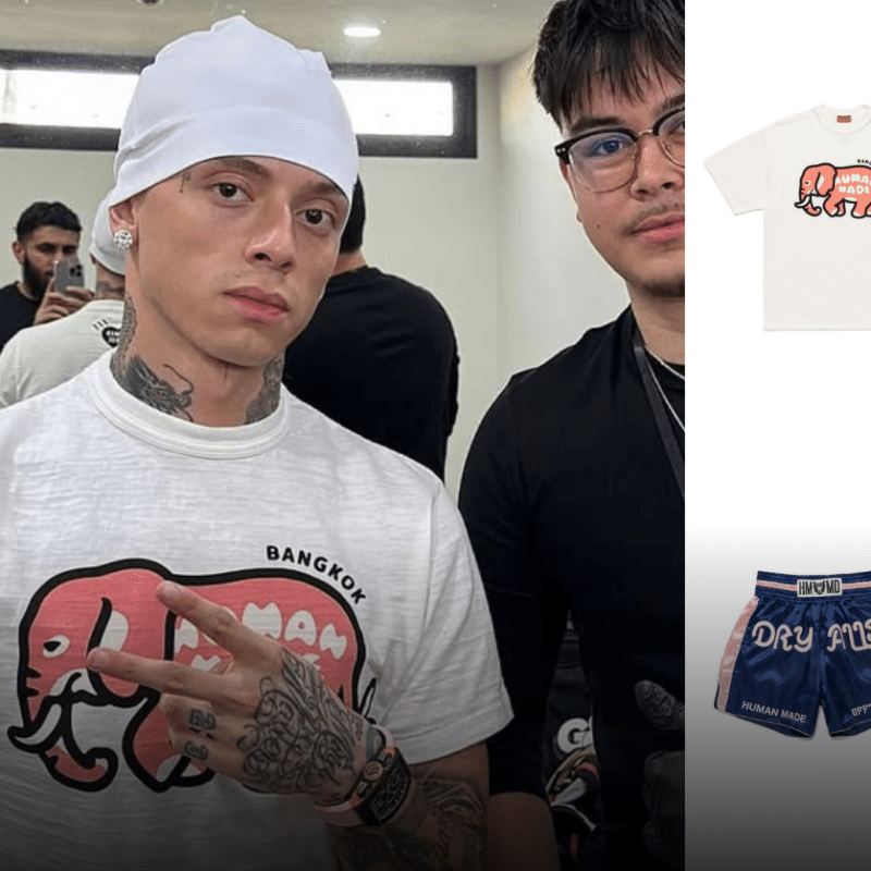
Ahead of the launch of its first Bangkok store at Central Embassy, ...
Wee use cookies to deliver your best experience on our website. By using our website, you consent to our cookies in accordance with our cookies policy and privacy policy